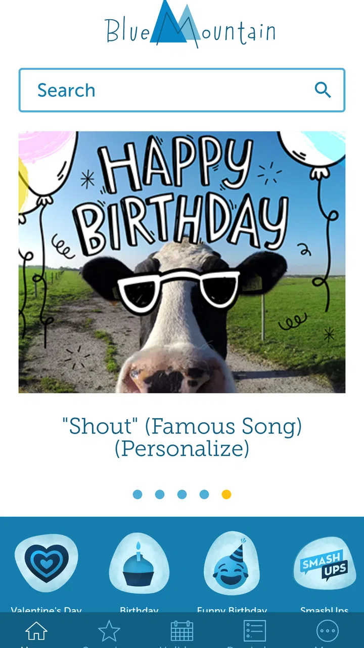
Blue Mountain Ecards
- 4.6
- Rating
- 100.00K
- Installs
- Free
- Price

 Analysis by App-foxy
Sending a thoughtful card is still one of the simplest ways to make someone feel remembered, but the process can be surprisingly inconvenient when you are working from a phone. Blue Mountain Ecards takes a focused approach to that problem: it is a Lifestyle app from AGCM, Inc that lets me choose a digital greeting for a birthday, holiday, or another personal occasion and prepare it without reaching for paper, envelopes, or stamps.
After spending time with it, I see the appeal clearly. The app is aimed at people who want the emotional gesture of a card but prefer the speed and flexibility of a digital message. It is free to install, rated for Everyone, and currently sits at version 1.3.0 for devices running Android 9 or later. Its average rating of 4.6 from around 6,100 ratings suggests that many users find the basic idea useful, while the app’s more than 100,000 installs show that it has found a real audience without trying to be a complete social network or messaging replacement.
My overall impression is positive but measured. The experience works best when I already know whom I am greeting and what tone I want. It is less convincing if I need highly personal artwork, a fully custom design, or the broad communication tools offered by a normal messaging app. The important question is not simply whether it can send a greeting; it is whether a prepared e-card feels appropriate for the moment and whether I am comfortable with the choices presented while using it.
You May Also Like

 Pandora - Music & Podcasts
Pandora’s Music Is Easy to Start, but Harder to Recover
Pandora’s strength is its low-effort path from a seed to a station. Its weak spot is how much confidence it asks you to place in connection, setup, and quiet recovery.

 8 Ball Pool
 Is Built on Rivalries, Rematches, and Routine
A close look at the rivalries, rematches, shared routines, and unanswered safety questions that turn a quick pool match into a persistent mobile community.

 Samsung Music
’s Quiet Strength Is Playing What You Already Own
Its reach comes less from spectacle than from dependable access to a personal library. That simplicity is both the app’s strongest retention engine and its ceiling.

 AccuWeather: Weather Radar
AccuWeather Review: A Quick, Clear Forecast for Everyday Decisions
For everyday plans, the best forecast is the one you can understand quickly. AccuWeather makes rain timing, radar, and local conditions easy to act on, with a few trade-offs.

 Hill Climb Racing
Why Hill Climb Racing Still Turns Crashes Into One More Run
A tiny car, a bumpy hill and one more upgrade: Hill Climb Racing keeps resurfacing because its simple chaos makes every near-miss feel personal.

 AliExpress - Shopping App
AliExpress Makes Global Shopping Feel Personal, but Shoppers Bear the Risk
AliExpress turns a global marketplace into a pocket-sized discovery engine. Its reach is useful, its shopping loop compelling, and its trade-offs easy to miss.
More From Our News Desk
View All News


What the app is really useful for
The strongest use case is the small moment that is easy to overlook. I can imagine opening the app during a lunch break, finding a birthday card that matches a friend’s personality, adding my message, and sending it before the day disappears. That is more deliberate than dropping a quick emoji into a chat, but much faster than shopping for a physical card.
It also suits people who regularly remember occasions at different times of day. A digital card does not require a trip to a store, and it avoids the practical problem of buying a card too late. For family members who live far away, the format can feel warmer than a plain text message while staying convenient for both sides.
The app’s focus is important. This is not something I would install expecting photo editing, event planning, a contact manager, or a full inbox. Its value comes from narrowing the task to greetings. That narrow purpose makes the app easier to understand, but it also means the quality of the experience depends heavily on whether its available card styles fit the occasion I have in mind.
I found it helpful to decide on the recipient and the emotional tone before browsing. Looking through cards without a clear idea can turn a quick task into endless scrolling. If I first decide whether I want something warm, playful, formal, seasonal, or simple, the selection process becomes more intentional. That small habit is one of the easiest ways to avoid sending a card that looks attractive but does not sound like me.
How I would use it on an ordinary day
Suppose I realize in the morning that a relative’s birthday is that evening. I would open the app, browse the birthday section, and reject anything that feels too generic for our relationship. Once I find a suitable design, I would write a short message in my own words rather than relying on the card alone. I would then review the recipient details carefully before sending, especially if I had several people with similar names in my contacts or messaging workflow.
That final review matters more with digital greetings than many people expect. A polished card sent to the wrong person is much worse than a plain message sent correctly. My practical advice is to treat the last screen as a confirmation step: check the name, read the message once, and make sure the selected occasion matches the recipient.
For recurring occasions, I would keep a small personal note outside the app with the kinds of messages each person appreciates. The app can provide the visual presentation, but the meaningful part still comes from choosing words that show I know the recipient. A short reference to a shared memory will usually make a ready-made card feel less ready-made.
Trust begins with clear expectations
I approach greeting apps with a little caution because they can involve personal names, contact details, messages, and sometimes images. The right standard is not to assume that a pleasant design automatically means a private experience. Instead, I look for visible choices, understandable prompts, and enough control to decide what I am sharing and with whom.
Blue Mountain Ecards is easier to evaluate when I keep its purpose in mind. It is a card-sending tool, so the sensitive moment is not browsing a design; it is preparing and delivering a message. I would pay closer attention whenever the app asks me to choose a recipient, grant access to information, or complete a purchase than when I am simply looking through greetings.
I do not treat the app’s high rating as proof of a particular data practice. Ratings tell me that many people are satisfied overall, but they do not replace reading an in-app explanation or the relevant privacy information. My own rule is straightforward: if a permission or sharing choice is not necessary for the action I am trying to complete, I pause before accepting it.
This is also where the age rating matters. Because the app is suitable for Everyone, it may be considered by families and younger users, but an Everyone rating is not a substitute for adult guidance around messages, recipients, purchases, or personal information. I would still explain to a child what a recipient is and why they should not enter private details casually.
Controls I would check before sending
The most important controls are the ones connected directly to the recipient and the message. Before I send anything, I want to know exactly which person is selected, what text will accompany the card, and whether the action is final or can be changed later. Even when an app makes those steps feel simple, I prefer to slow down at the point where information leaves the device.
I would also look for clear ways to manage account access if the app offers sign-in during use. A user should be able to understand whether an account is optional or required for the task, and what happens if they later want to stop using the service. If I create an account only to send one greeting, I would want a visible route to manage that account rather than leaving it unused indefinitely.
Another practical control is purchase awareness. The app is free, but it includes in-app items priced from $6.99 to $35.99 each. I would not assume that every attractive card is included at no cost. Before confirming a purchase, I would check the item price on the payment screen and make sure the device’s purchase approval settings match the person using it.
That is especially important on a shared family phone or tablet. A child can understand the card selection without understanding the financial consequence of tapping a purchase button. The Everyone rating makes the app broadly accessible, but household purchase controls remain the responsibility of the account holder.
Where personal information enters the experience
The most data-sensitive part of using a digital greeting service is the delivery step. A card needs enough information to reach its recipient, and the message itself may reveal a relationship, a location, or a private event. I would avoid putting sensitive details into a greeting unless they are genuinely needed. A birthday wish does not need a home address, travel plans, medical information, or anything else that could create risk if it were seen by the wrong person.
I also prefer writing messages that are personal without being overly revealing. Instead of including a complete schedule for a surprise gathering, I would send a warm note and share logistics through a channel I already trust. This keeps the e-card focused on the sentiment and reduces the amount of information attached to it.
Images deserve the same care. If I were given an option to add a photo, I would choose one that is appropriate for the recipient and does not expose other people, documents, or identifying details in the background. I would also ask whether the image is necessary. A well-chosen design and a sincere sentence can be enough.
When an app presents a permission request, I look at the wording rather than tapping through automatically. If access to contacts appears, I would consider whether selecting a recipient manually is a better fit for my situation. If notification controls appear, I would decide whether reminders are useful or whether they could reveal private information on a lock screen. These are small choices, but they give me more control over how the app fits into daily life.
What I like about the card workflow
The central workflow is approachable because it follows a familiar sequence: choose an occasion, select a design, write a message, and send it. That structure is more comfortable for me than starting with a blank canvas. When I am busy, the app gives me a visual starting point without forcing me to learn a complicated editor.
I also like the distinction between a greeting and an ordinary chat message. A card creates a little more ceremony. It tells the recipient that I paused to choose something rather than firing off the first sentence that came to mind. That difference is valuable for birthdays, holidays, congratulations, and moments when a plain “thinking of you” message feels too abrupt.
The developer, AGCM, Inc, has kept the product identity focused enough that I can understand what I am opening it for. The current version, 1.3.0, is a useful reminder to keep the app updated through the normal store process, particularly when an app handles sending and account-related actions. I do not view a version number as a guarantee of privacy or reliability, but using the current release is generally preferable to staying on an outdated build.
The free entry point is another strength. I can explore the basic experience before deciding whether a paid card is worthwhile. That makes the purchase decision more deliberate: I am paying for a particular design or option because it suits the occasion, not paying simply to discover whether the app is usable.
Where the experience can create friction
Ready-made cards always involve a compromise. They are faster than designing something from scratch, but they may not capture an unusual relationship, a niche sense of humor, or a very specific event. If I need a card that includes a personal photo collage, a detailed invitation, or a custom illustration, I would probably choose a design tool or a messaging app instead.
There is also a difference between convenience and emotional authenticity. A beautifully formatted card can still feel impersonal if I send it with a copied sentence that does not sound like me. I would use the artwork as a frame, not as a replacement for my own voice. This is particularly important for sympathy messages or serious personal situations, where a generic tone may feel out of place.
The in-app pricing can be another point of hesitation. Free installation is helpful, but paid items ranging from $6.99 to $35.99 are not trivial purchases for a casual greeting. I would compare the cost with the value of the occasion and check whether a free design communicates the same feeling. A physical card may be cheaper in some situations, while a handwritten note may be more meaningful in others.
Digital delivery also depends on the recipient being comfortable receiving this kind of message. Some people love electronic cards; others would rather receive a text, an email, or something physical in the mail. I would not use the app automatically for an older relative who rarely checks digital messages. The best format is the one the recipient will actually see and appreciate.
How it compares with familiar alternatives
Compared with a normal messaging app, Blue Mountain Ecards offers more presentation and occasion-specific structure. A chat app is better for immediate back-and-forth conversation, photos, voice messages, and planning. This app is better when I want the greeting itself to feel like a small event rather than one line in an active conversation.
Compared with buying a physical card, the digital option is faster and avoids paper, postage, and the need to visit a shop. The trade-off is that it lacks the tactile quality of handwriting and the keepsake value some people associate with a card placed on a shelf. For close family milestones, I might still choose paper; for a last-minute birthday or a distant friend, an e-card makes more sense.
Compared with a design application, the dedicated greeting format should require less effort. A design tool gives me more control over fonts, layouts, images, and branding, but that flexibility comes with more decisions. I would choose the design route for a wedding announcement or a carefully planned invitation, not for a quick personal greeting.
Compared with email, an e-card can feel more visually intentional, while email is often easier for longer messages and attachments. I would use email when context and detail matter, and the card app when the emotional signal should be immediate and compact.
Who should use it, and who should skip it
I would recommend trying it if you often remember occasions late, prefer digital communication, and like having a designed starting point. It is also a good fit for someone who wants to send several different kinds of greetings without learning a full creative suite. The Everyone content rating and free installation make it easy to explore, although household supervision is still sensible around personal information and purchases.
I would be more cautious about recommending it to someone who wants complete creative control or who considers a greeting meaningful only when it is handwritten. The app may also be a poor match if your recipients rarely open digital messages, if you need a detailed invitation workflow, or if you want a single place for ongoing conversations and replies.
Privacy-conscious users should make their own decision by reviewing the app’s visible prompts and applicable privacy information before sharing contact details or message content. I would not grant broad access automatically, and I would use manual entry where that is practical. The best experience comes from treating every recipient and purchase screen as a deliberate choice rather than rushing through the setup.
My cautious verdict
Blue Mountain Ecards succeeds because it addresses a specific everyday problem without pretending to replace every other way of communicating. I like it most as a quick, more polished alternative to a plain text greeting, especially when I want to acknowledge an occasion before the day gets away from me.
Its limitations are equally clear: prepared designs cannot match truly personal artwork, digital delivery is not right for every recipient, and the paid items require attention before checkout. I would also keep messages and images appropriately modest, review permissions and account choices carefully, and avoid assuming that a friendly interface tells me everything about data handling.
With those boundaries in mind, I think the app is worth trying for people who want convenient digital cards and are willing to add their own words. The free starting point lowers the risk of testing it, while the broad user base and strong average rating make it a credible option in the Lifestyle category. My recommendation is to use it as a thoughtful shortcut, not as a substitute for personal judgment. When the design fits, the recipient welcomes digital greetings, and I take a moment to check the sharing and purchase details, it can turn a rushed reminder into a genuinely considerate message.
FAQs for Blue Mountain Ecards
01What is Blue Mountain Ecards?
Blue Mountain Ecards is a digital greeting-card service that lets you send animated and musical cards for occasions such as birthdays, anniversaries, holidays, thank-you messages, and everyday greetings. Instead of buying and mailing a physical card, you choose a design, personalize the message, and share it electronically with the recipient. Available features and card access may depend on the current membership plan and platform.
02Do I need a subscription to use Blue Mountain Ecards?
Some Blue Mountain Ecards content may be available for free, but many premium designs, animations, music options, and sending features can require a paid membership or subscription. Before downloading or signing up, check the price, billing frequency, trial conditions, and cancellation policy shown in your region. Subscription terms may differ between the website, Android, and iOS platforms.
03How do I send an ecard with Blue Mountain Ecards?
After selecting a card, you generally personalize it by adding the recipient’s name, your message, and sometimes a signature or scheduled delivery date. You then enter the recipient’s email address or use an available sharing option to send it. Carefully review the address and delivery details before confirming, because an incorrect email address may prevent the card from reaching the intended person.
04Can I schedule an ecard to arrive on a specific date?
Blue Mountain Ecards may offer scheduled delivery for certain cards and occasions, allowing you to prepare a greeting in advance for birthdays, anniversaries, holidays, or other important events. Availability can vary by card type and account plan. It is still wise to verify the recipient’s email address, time zone, and the selected delivery date before completing the order.
05Is Blue Mountain Ecards safe and compatible with my device?
Blue Mountain Ecards is designed for sending digital greetings, but users should download it only from an official app store or access the verified service website. Check the listed Android or iOS requirements before installation, since compatibility can vary by device and operating-system version. Also review requested permissions and privacy terms, particularly when providing contact information or recipient email addresses.
Pros
- Wide selection of scenic and seasonal mountain-themed designs.
- Simple interface makes browsing and sending cards quick.
- Cards can add a personal message before sharing.
- Suitable for birthdays
- holidays
- and everyday greetings.
- Digital delivery is faster than mailing a physical card.
Cons
- The theme selection may feel narrow for non-nature occasions.
- Some cards may include branding or promotional elements.
- Requires internet access to browse and send cards.
- Recipient compatibility can vary across messaging platforms.
- Advanced customization options may be limited.

Blue Mountain Ecards
Gallery